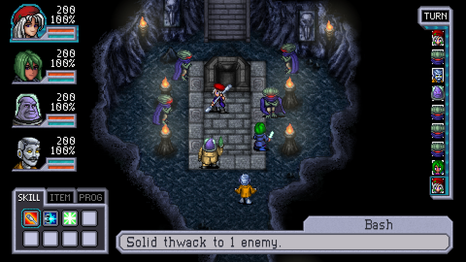
We’ve been tweaking the battle UI since the last screenshot based on various feedback you all gave us and thought we’d share the results.
We shrunk the portraits a bit so that they wouldn’t draw as much attention away from the action and then we swapped their position so that we could add another character slot to the time bar. We redesigned the name/description bar so that we’d have more space for text. Finally, we made the numbers in combat slightly smaller (we think it looks better this way).
As usual, this is a work-in-progress and so the layout and art is subject to change between now and the game’s release.


I think it’s perfect! You don’t lose any of the visual details on the side bars, but they allow for a bit more screen space. Love it, can’t wait to play this game.
There’s actually a third iteration of this here:
http://zeboyd.com/wp-content/uploads/2014/03/cshuitest7.png
It’s all still WIP but we’re getting pretty close.
Yeah, the new character portrait is much improved. I didn’t comment on the portraits in the previous one since WIP and all that.
Yes, this is much better. I didn’t want to say anything earlier, since I love Bill’ss artwork and never want to hurt his feelings, but the previous character portrait for Alyssa kinda made her look like a man.
Much, much better.
I like this one a lot better. The only constructive criticism that I could give is that I think Alyssa’s portrait looks rather funny looking. Specifically the space between (hers, not our) right cheek bone and where her mouth is. Her face just looks a bit awkward. Aside from that this screenshot is a massive improvement for sure. Good job Bill & Robert!
Looking really good. One thing I noticed is that the skill select and action name (skill, item, prog.) are far apart from each other. This means that while the player is learning to match the action icons to a name their eyes have to travel the width of the screen. I understand why you’d want it out on the corner to give more room in the center though. I hope you don’t mind but I took a minute and tweaked it a little.
https://dl.dropboxusercontent.com/u/11316063/csh_battle_ui_tweak.png