From the look of things, Hypership Out of Control isn’t selling very well, which is sad since it’s a really fun game. Can’t say I’m horribly surprised – releasing within a day of a new Halo game & 3 XBLA titles isn’t good timing. But it got me thinking about another reason why it could be underperforming – nostalgia.
There’s a big trend of late to make games with retro aesthetics. Gamers like being taken back to their childhood and developers like making these kinds of games because they’re easier to develop. However when developing a retro game, you need to take into account that most gamers don’t really want a RETRO game. They don’t want a game that adheres strictly to the limitations of an NES or Genesis or whatever. Instead, they want a game that matches the rosy and inaccurate picture they have in their memory.
People see stuff like the Scott Pilgrim game and they think retro, but Scott Pilgrim’s visuals are probably better than what you would be able to get out of a real SNES game, to say nothing of a NES game.
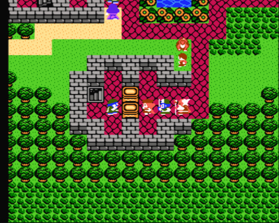
Here’s another exmample – a screenshot of Dragon Warrior IV (i.e. Dragon Quest IV), a late era NES RPG.

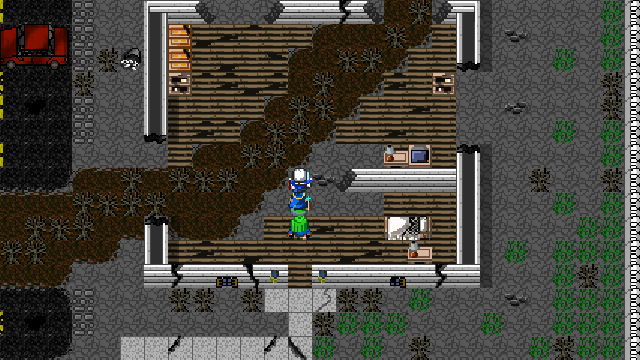
…and here’s a screenshot from our retro RPG, Breath of Death VII: The Beginning.

See the difference? Breath of Death VII has a bigger field of view, more variety in tiles, and more detailed and colorful tiles & characters than the NES game. There’s no way on earth that the Breath of Death VII graphics could be done on an actual NES, but when most people see those visuals, they think 8-bit.
Sure, we could have done Breath of Death VII in a more faithful 8-bit style, but that’s not what most people want. They want perceived reality, not actual reality.
Same thing with gameplay. If you want to evoke the same kind of feel that people got from playing those old classic games, you can’t just copy their gameplay, because the gaming world has changed since then. The gameplay needs to match the nostalgia, not the actuality. With Breath of Death VII, we kept the same basic gameplay structure of an old NES RPG, but we added some new systems like multi-character techniques and LV-Up options. More importantly, we changed the pacing – most NES RPG are glacially paced by today’s standards. We didn’t just speed up the pacing to match today’s standards, we actually sped it up beyond the pace of most RPGs today. As a result, you have a tight, streamlined, fast game that most people seem to really enjoy.
Going back to Hypership Out of Control, it looks like an actual early NES game and that could be its undoing. To be successful, you need to give players what they actually want (retro evolved as Geometry Wars puts it), which is not necessarily what they say they want.


You know, I looked at BoDVII and CStW as a sort of Cross between the NES 8-Bit and SNES 16-Bit if not more like a 16-bit game like the SNES Zelda. Then again it made me smile to see a fame made in that style of old school JRPG with the newer gaming design ideas.
You guys know NES runs at 60 fps, right? I know this is late, but it irks me to see people here saying 60 fps is something new.
RE: Alex
the screenshot of BODVII looks scaled (nearest neighbor) because the screenshot had to be resized to fit the website. Doesn’t look funky like that in-game.
I agree that the pacing in the DQ4 remake felt off, but I think that’s just a problem with the remake messing with things that were already pretty well balanced. I still think faster paced is better in the vast majority of cases.
You’ll be pleased to know that the tilework in our upcoming game is much better than that in Breath of Death VII due to greater experience and longer development time. I agree that Cave Story looks fantastic, but keep in mind that it’s a game that took over 5 years to develop – as a group of developers trying to turn game development into a living, we don’t have the luxury of spending such a huge amount of time on a single project.
I disagree. Dragon Warrior IV’s pacing is perfect. I want RPGs nowadays to have that sort of pacing unless the character takes up a larger portion of the screen (Chrono Trigger style). I hate the DQ4 remake because the characters move ridiculously fast and it doesn’t feel like a true adventure. Making the characters move faster doesn’t make an RPG better. It actually makes it worse. If “true retro” means the game pace makes the player feel like they’re actually going on an adventure, use the true retro pacing.
It’s gotten to the point where people think of the Dragon Quest series as a series of games not to be taken seriously, as is written here: http://dragonquest.wikia.com/wiki/Dragon_Quest_%28series%29 . The series was serious and emotionally intense in Dragon Quest IV and V for NES and SFC, but they butchered that feeling with the later games and the faster-pace remakes. In the DQ4 remake, they butchered the English script and simplified the spell names, showing that they think their audience is full of retards who can’t handle an immersive game’s pace and style. When I was young playing Dragon Warrior IV on NES, I learned the words, “elude”, “nimbly”, “blaze”, “ominous”, and many other words that they expect kids nowadays to not want to learn. If “retro” means that emotional intensity remains intact, I’m all for it.
Your screenshot for Breath of Death VII looks sloppy. Some of the tiles look like they’ve gone through a nearest-neighbor scaling algorithm. Also, look at how the south wall’s pixel height looks nice, but the tile borders on the path look thinner than the walls’ pixel height. You wouldn’t see such sloppiness in a game like Cave Story, which was made by an author who truly understands the good qualities of retro tile graphics. I, personally, do prefer the Dragon Warrior IV screenshot over the Breath of Death VII screenshot in this article. I’m not kidding. It looks better to me because it’s simple to understand at a glance and it shows that the authors worked harder on what really matters: the story and gameplay. In the Breath of Death VII screenshot, I don’t know if those weird dark bushes (which are way too dark for their background, by the way) are walkable or not.
The vertical broken wall tiles in the Breath of Death VII screenshot don’t reach the ground. Look at them. The edge is too short to portray a full wall height. You don’t see such sloppiness in Dragon Warrior IV’s tiles.
@John, Contra and Super-Contra on XBLA are the coin-op arcade versions, not the NES versions! Coin-ops blew away home consoles back then, and yet they can still be mistaken for an NES today. Point in hand.
Great post. I completely agree. And while there are examples like Mega Man 9 and 10 can do well today, consider that their gameplay was top notch back in the days of NES, near perfection already, so there’s nothing really more than can be done. Contra is another example. These are the reasons these classic were so amazing back then. The rest of the games were just ok by comparison, and it’s those when you go back and play, you wonder how you could even stand them. A good example would be the slow pace of Phantasy Star II which was amazing back in the day, but now I don’t have the time to play such a slow game (partially because I’m older and have responsibilities now, but that’s part of the equation, the change in your audience and what they want, and how much time and money they have to invest).
I’m not so sure about that though, maybe there are exceptions. Take Mega Man 9 & 10 for example. Those games for the most part seem to adhere to what the NES games were like and I absolutely loved them. The only difference I can think of is the addition of “Easy” mode and the ability to save your progress instead of using the password system… or maybe my memory is just starting to deteriorate on what it was like back then?
In fairness to Hypership, while I love that type of genre, I’ve found that I can’t keep up with most Shoot ‘Em Ups released now a days (my eyes) and usually pass on them when I hear about them. The problem for me is that the modern games in the genre have too much on screen with 3D hazardous objects and 3D backgrounds that scew with my peripheral vision and makes it hard for me to tell what really is a hazard on the screen. Given that Hypership is of the older generation of graphics, I probably should give it a try though.
I hadn’t thought about it like this before, but you are right. I’ve played the XBLA versions of some of the old NES games (i.e. Contra and various Mega Men (or is it Mega Mans?)), but I dislike that they don’t use the entire screen. As a result, when I’m looking for something new to play, I look for something that uses widescreen and slightly more colorful.
I think this is why the re-releases of Final Fantasy 1 & 2 did so well on the Gameboy Advance, it was the old game, but they updated the graphics for it. Yes, they could have just ported the code to GBA, and it still would have sold decently, but gamers really prefer games that take advantage of their hardware.
Oh, I agree that Hypership has a number of advantages over old NES graphics (60 fps, no flickering, widescreen). Sadly, these are the kinds of advantages that you can’t really show off in screenshots.
From the look of things, people who try the game out tend to really like it. The problem is getting people to try it in the first place.
Hopefully, the game will get picked up by a big media outlet or promotion before too long since it would be a horrible shame to have a game that fun sink into to oblivion.
Hypership is blocky, like an NES game but it is wide-screen, 60 fps, and not plagued with slowdown. It does things that NES graphics don’t but that defense aside, I know what you’re saying.
For me I love retro graphics (gameplay on the other hand, not as much). I hoped others would too or at the very appreciated a good game. I think XBLIG skews younger though and for many gamers there, Hypership looks like a game the predates anything they knew. When you hit that point, its not nostalgic, its just old.
Interesting take, though Hyper ship is only a few days old. Your point is noted though that if the same artist that did Kris’ box art, also did his sprites…his games would look as amazing as they play.
I agree completely.
I always dreamed for a ‘remake’ of River City Ransom but in the same style/vein of the original. Scott Pilgrim is close, or about as close as I’ll probably ever get to seeing such a thing — in this case though, as you say, the visuals and all are far greater than you could have done with the old systems.
I was going to write more, but, whatever I’d have said, you’ve already said here. 🙂
I just wanted to add that when there is a certain, specific series of games that have a certain, specific nostalgic appeal, then people WILL want it to adhere to its original 8-bit aesthetic. But this is the exception due to an existing franchise, not a new game trying to break into the market. The example I’m referring to is Mega Man 9 and 10. But if you were to make something that looks like your typical average NES game as a new title, it’s an uphill battle.