Hi everyone! Bill Stiernberg here. For today’s Art Column, I wanted to talk a bit about sprites!
Everyone does sprites differently – it’s actually a pretty complex art. So rather than going into great detail about all the types and varieties and styles of pixel art and spritework, I wanted to give you an idea of how I’ve been changing and improving the type of spritework I do for our games. I’ll be focusing on the main character sprites since those are the most recognizeable.
With Breath of Death VII, the goal was simple: Two guys will start from scratch and make a short, but fun, 8-bit era style RPG, and finish it in about 3 months. This was our first game as Zeboyd, and we pulled it off. To do that, we absolutely had to keep the art requirements reigned in; thus we chose “8 bit.”
I decided early on that most people / gamers tend to remember games as much more advanced than they really are. As such, I did not feel the need to stay too strict within the confines of what a NES could actually do. Rather, I felt that if I stretched out a little bit from a strict 8 bit palette, I could produce art faster, and perhaps give the game a little more detail than a true NES game would be capable of. The point was to remain efficient, and produce a game that looked 8 bit to the modern gamer, even if it wasn’t technically possible on the NES.
To stick to the look of 8 bit, of an early Dragon Quest game, Breath7 used a simple 16×16 sprite for characters:

The sprites are also using only 2 frames of animation, and are always animated. This is very typical of early Dragon Quest games and it makes the squatty, big-headed sprites feel more alive by always-moving, and allows the developer to only need 2 frames of animation in each of 4 directions. I also stuck to two main colors for the sprite (white, blue) with little additional splashes (red, gold) and used shading and highlights sparingly. The simple color palette and details within the confines of the 16×16 sprite maintained a NES look, even though this particular sprite was more detailed than typical NES sprites.
When we started Cthulhu Saves the World (CSTW), the original idea was to basically take Breath7 as a template, and simply add more color and detail – without going overboard and committing to a massive multi-year production. However, I also knew that we really ought to have more frames of animation for the walk cycle, as well as standing-still frames of art:

The Cthulhu sprite remains 16×16 in size. However, it appears more detailed because I simply used more colors to detail and define him. I also decided on using 4 frames of animation for the walk cycle. I tried it initially with 3 frames, but the resulting Cthulhu looked to be moving very mechanically that way. The 4 frames shown above are all unique and it gives me some freedom to make it smoother and show his leg and wing movement, where 2 or 3 frames would look jerky otherwise.
The next game we did was for Penny Arcade, On the Rain-Slick Precipice of Darkness 3. With Rainslick3, we initially designed the game to have more limited maps. Knowing this, I felt like I could spend more time on the character sprites. I also wanted to be better able to show Gabe, Tycho, and Co. since the PA characters are a selling point to many people. So in order to upgrade our sprites’ look without over-extending development, I decided to make RS3 follow in the footsteps of Final Fantasy VI for character sprites.

Here I have finally moved up to a 16×24 size sprite. That gives me 8 more rows of pixels in height to work with. This allows me to really give heads and faces more detail and give the bodies more definition, especially the outfits. It did not feel like a huge step up at the time, but looking at the game as a whole, having the 16×24 sprites really helped Rainslick3. It was also extremely useful during battles — we wanted to try out a sidevew for battle screens, and having larger sprites for maps allowed us to show the bigger, more detailed sprites in the FFVI style during battles as well.
Again, these sprites have 4 frames of animation in each of 4 directions. They also have a standing frame. With more room to work with, I was able to give the arms and legs more definition and create more of a regular looking stride. This also helped later, having 4 frames in each direciton, when drawing the character Jim, who… well he doesn’t walk, since he’s a skull in a jar.

With Rainslick4, I spent most of my efforts trying to really amp up the visuals on the game maps. I can talk about that in a later article, but the character sprites remained the same style and detail in RS4 as they were in RS3.
Finally, with Cosmic Star Heroine, I now have 4 full RPG’s worth of building game assets under my belt over the course of.. like 3 or 4 years or something. I am getting much more efficient at it than I was in the beginning, and learning new tricks and ways to make sprites more interesting and detailed in relatively less time.
With CSH, we want to take the game up to the next level with our presentation. We know we still want to use 16 bit, but this particular style still has so much more room for interesting sprites and visuals.
So in the past few weeks I’ve been considering just how some of the classic SNES and Genesis/SCD RPGs handled sprites. What did they do that made them pop in people’s minds? Why did they look so interesting compared to earlier games, despite being limited by the same hardware?

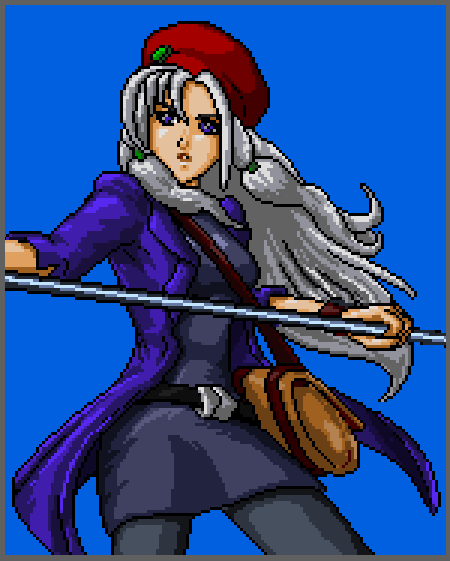
I figured a few things out in my study. The primary thing I noticed is that a lot of RPGs have character sprites with totally unnatural poses! It sounds like common sense when you think about it — but most RPGs have a “standing” frame where the character is standing straight, arms down, facing 90 degrees. Like a robot. That’s not natural! So with Alyssa, I wanted to give her standing frame a more natural looking pose.
I also went ahead and upped our sprite size a little more. Now I am drawing in 16×32 size, but I am also leaving myself room with the new game engine to vary the sprite sizes in case other characters vary outside that box. This will help with making characters look unique. But as for Alyssa there, I was also able to add more detail to her outfit, and give her a satchel with the added sprite room. I will also have more room to draw emotions on her face during certain scenes thanks to the added space. All in addition to the more natural pose.
Then I went to animate her walk cycle.

The next thing I noticed when studying older sprites was that the run and walk cycles were more natural. Gone were the conventions of, say, FFVI, where you had foot forward, feet together, other foot forward, feet together – repeat. This new Alyssa sprite now uses 6 frames of animation rather than 4. There’s a huge advantage to this. Most noticeably, I can animate her gait more naturally. Her feet aren’t robotically placed forward/center/back like my older RS3 and 4 sprites. But I also noticed that by having 6 frames of animation, I could add more nuance to her animation. For example, she has little tufts of hair that I can animate now. With 4 frames of animation, that sort of thing would look jumpy and erratic. With 6 frames, I can now more smoothly animate the small details, such as the hair on her front. I can also create a wave-like effect of her hair flowing behind her in her north-facing animation cycle. This is the kind of thing that having only a few more vertical pixels and 2 extra frames of animation allows. It’s not much more to ask, adding 8 more lines of pixel rows and 2 extra animation frames – but the increase in flexibility in animation and detail is surprising.
That’s it for today’s Art Article. I am still learning and still examining the methods for drawing and animating sprites in this style. I am really excited to get the other characters done, and to try my hand at animating them for battle poses and attacks. It’s a hugely interesting and rewarding experiment so I hope you enjoyed reading about my preliminary discoveries!
Seeya next time!
-Bill Stiernberg (bill_at_zeboyd on twitter. Deviantart page.)
Links to previous Art Columns:
Fantastic work. I especially like where you are going with the secondary animations (hair bounce, especially the hair wave moving north).
Two thoughts: with the side-view walk cycle, you may want to move her northmost thight forward a pixel, while keeping the calf and foot in the same position. When people walk, the motion flows from the hip, so the upper leg would be a bit more forward. Similarly, it might look better if you moved the northmost foot up a pixel in mid-stride — she looks a bit like she’s walking on a flat plane in a side-scrolling platformer rather than in a top-down RPG.
Even if you don’t think my advice is worth trying (or you try it and it turns out to be terrible), these are still amazing sprites. Better than the ones I made when I was doing pixel art, especially that hair.
Dudes,… Now that I’m producing art (again) and working on developing, I have a ‘newfound’ respect for this profession or craft is more like it… So many hours are spent on production and programming that I know why little bugs, typos, and graphic errors can show up on finished products… QA Testers don’t get enough credit (in my opinion) from the fans and “big wig” exec(s)… And they sure as hell don’t get payed enough neither…. Just saying. Anyway CSH is looking good so far… I love that protagonist already 😉 Well keep up the awesome job dudes… Looking forward to the game too… Sigh, I’m off…. Back to the “joy” that is creating sprites… Seriously though, spriting is awesome!!! (positive energy inserted) lol!
I always love reading about game design from the people who make my favorite games. I hope you continue posting things like this. Thank you for sharing!
Absolutely gorgeous.
This is a great article! I love how these very distinct visual styles can be broken down into technical terms (16×16 – Final Fantasy IV, 16 x 24 – Final Fantasy VI, 16 x 32 – Chrono Trigger). I really like these behind-the-scenes style posts. Looking forward to the Kickstarter! 🙂
Ryan:
Yeah, all of our games scale up by in code. So, I may draw a character at 16×16, but on at a 1280×720 resolution, the game engine scales it up by a factor of 3 (so Cthulhu’s sprite would be 48×48).
In the example images I posted in this article, I only scaled each sprite up by a factor of 2. So like, cthulhu there is only 32×32 in size.
Nice read. Were the 16×16 sprites used in the first two games scaled up in size in the code? They appear a lot bigger than 16×16 on screen.
The billowing hair in the up animation is a really nice touch.
Good article. As someone who dabbles in pixel art here and there (mostly in RPGs I start planning but that never pan out) I can say that I found this pretty interesting.
I have to confess that I wasn’t a huge fan of the CSTW walk cycle because the extra frames really stood out. Yes the animation was a lot smoother but since the sprites were 16×16 I felt the smoothness was out of place and inconsistent with the art direction.
I love the new walk cycle for Alyssa. Do I sense that you guys were inspired a bit by Chrono Trigger for the more natural “still” pose? I have to say it looks very natural and looks amazing. The jump in quality and skill from BoD7 to this is really oustanding, I have to tip my hat to you guys.
If you don’t mind me being nitpicky, I find that her foot is a little too fat in her sideways animation (the last frame where her leg is fully extended). Please take it as you will, I don’t want to take away from the fact that I think she looks wicked.
Keep posting these evolution articles, they’re great!
Alyssa looks great, this was as well a very interesting and good read. I’m pumped for the KS.